Presentation Tips
12 min read
•September 27, 2026
Best Google Fonts for Professional Presentations
Discover the best Google Fonts for presentations, from clean sans-serif to elegant serif fonts, and learn how to create professional, readable slides.
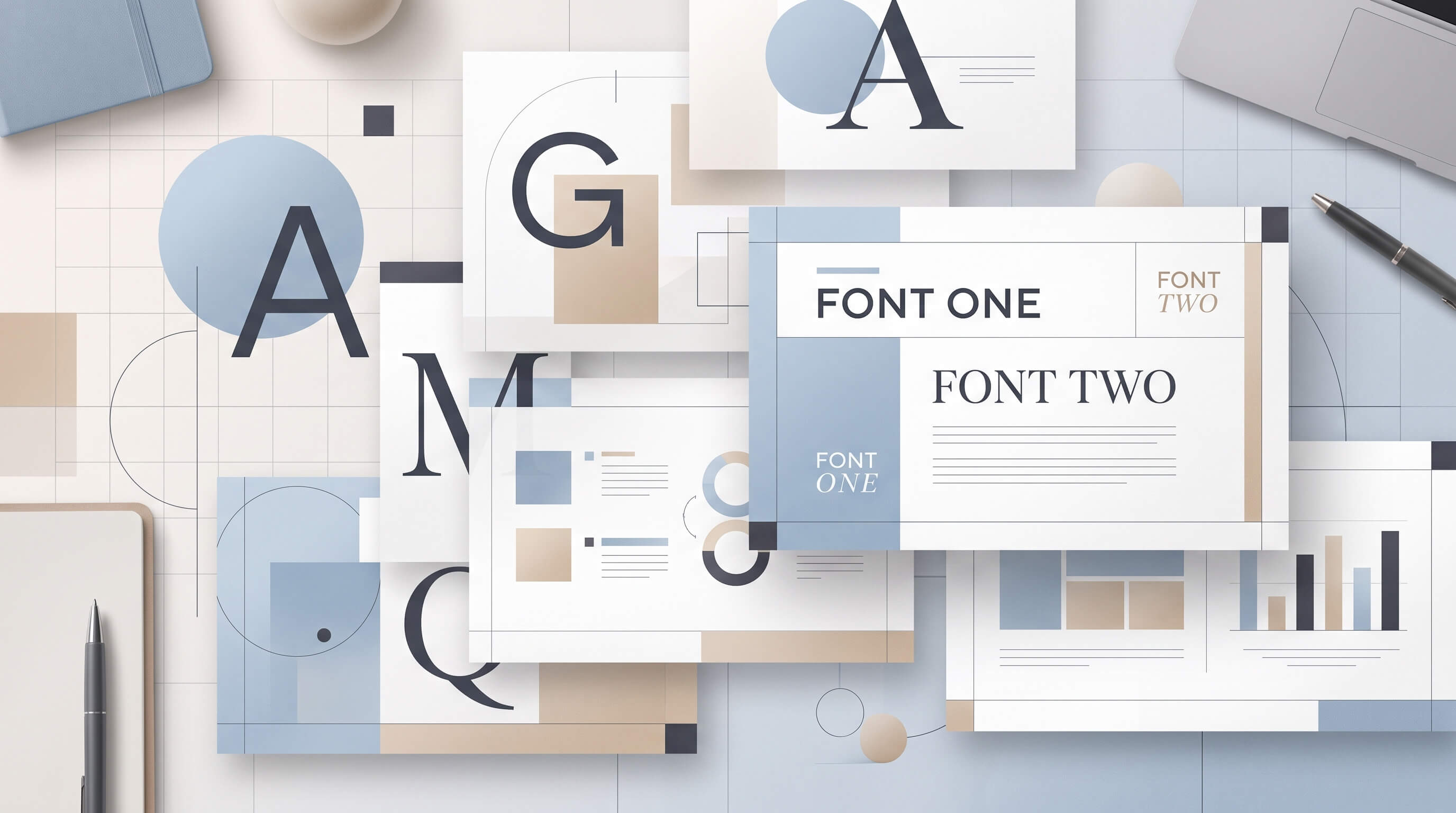
<p>Choosing the right font can make a significant difference in how your presentation looks and how easily your audience understands your message. A well-designed slide deck needs more than attractive colors and layouts. It also needs typography that is clear, consistent, and appropriate for its purpose.</p>
<p>Fortunately, Google Fonts offers a wide selection of free typefaces that work well for business presentations, educational slides, marketing reports, and pitch decks. Many of these fonts are also available in Google Slides, making them convenient for creating and sharing presentations.</p>
<p>In this guide, we'll explore the <strong>best Google Fonts for presentations</strong>, explain what makes each font suitable for professional use, and share practical tips for combining fonts and improving slide readability.</p>
<h2>What Makes a Good Presentation Font?</h2>
<p>Not every attractive font is suitable for presentation slides. Unlike documents, presentations are often viewed from a distance, on projectors, or on screens of different sizes. Your typography should make information easy to read without distracting from the message.</p>
<p>Here are five things to consider when choosing presentation fonts.</p>
<h3>1. Readability</h3>
<p>Readability should be your first priority. Choose fonts with clear letterforms and sufficient spacing, especially for body text, charts, and data labels. Avoid overly decorative typefaces for paragraphs or detailed information.</p>
<h3>2. Professional Appearance</h3>
<p>The font should match the tone of your presentation. A corporate strategy deck may benefit from a clean, modern sans-serif font, while an editorial or creative presentation might use a more expressive serif typeface.</p>
<h3>3. Font Weight Options</h3>
<p>Fonts with multiple weights give you more flexibility. You can use regular or medium weights for body text and bold weights for headings, without introducing too many different typefaces.</p>
<h3>4. Screen Compatibility</h3>
<p>Presentation fonts should remain clear on laptops, large displays, and projectors. Simple letterforms and appropriate font sizes help maintain readability across different viewing conditions.</p>
<h3>5. Consistency</h3>
<p>Using too many fonts can make a presentation feel disorganized. In most cases, two font families are enough: one for headings and another for body text. You can also use a single font family with different weights to create a consistent visual hierarchy.</p>
<h2>10 Best Google Fonts for Professional Presentations</h2>
<p>These Google Fonts offer a range of styles, from modern and minimal to classic and editorial. Each has different strengths, so the right choice depends on your presentation's audience, content, and visual direction.</p>
<h3>1. Inter</h3>
<p><strong>Best for:</strong> Business presentations, dashboards, and data-heavy slides</p>
<p>Inter is a modern sans-serif typeface designed primarily for screen readability. Its clean letterforms and balanced proportions make it a practical choice for presentations containing charts, tables, and detailed information.</p>
<p>Inter works particularly well when you want a contemporary, minimal look without making your slides feel overly decorative. Its range of font weights also makes it easy to establish a clear hierarchy between titles, subtitles, and body text.</p>
<p><strong>Why use Inter:</strong></p>
<ul>
<li>Clean and modern appearance</li>
<li>Highly readable at different sizes</li>
<li>Multiple weights for flexible typography</li>
<li>Suitable for corporate and technology presentations</li>
</ul>
<p><strong>Suggested pairing:</strong> Inter for both headings and body text.</p>
<h3>2. Roboto</h3>
<p><strong>Best for:</strong> Corporate presentations, business reports, and educational slides</p>
<p>Roboto is a versatile sans-serif font with a neutral, familiar appearance. Its geometric structure and open letterforms make it suitable for presentations that need to communicate information clearly.</p>
<p>Because Roboto is widely used across digital interfaces, it feels familiar to many audiences. It works well for presentations with a mixture of paragraphs, bullet points, charts, and diagrams.</p>
<p><strong>Why use Roboto:</strong></p>
<ul>
<li>Neutral and professional design</li>
<li>Good readability for longer text</li>
<li>Works well for headings and body copy</li>
<li>Suitable for business and educational content</li>
</ul>
<p><strong>Suggested pairing:</strong> Roboto for headings and body text, using different weights for contrast.</p>
<h3>3. Open Sans</h3>
<p><strong>Best for:</strong> Business reports, educational presentations, and text-heavy slides</p>
<p>Open Sans is a humanist sans-serif typeface designed with readability in mind. Its friendly appearance makes it a useful option for presentations that contain explanations, research findings, or detailed business information.</p>
<p>Compared with more geometric fonts, Open Sans has a slightly warmer personality. This can help make formal presentations feel approachable without sacrificing professionalism.</p>
<p><strong>Why use Open Sans:</strong></p>
<ul>
<li>Comfortable to read in longer passages</li>
<li>Friendly but professional appearance</li>
<li>Suitable for reports and educational materials</li>
<li>Offers several weights and styles</li>
</ul>
<p><strong>Suggested pairing:</strong> Montserrat for headings and Open Sans for body text.</p>
<h3>4. Montserrat</h3>
<p><strong>Best for:</strong> Pitch decks, marketing presentations, and title slides</p>
<p>Montserrat is a geometric sans-serif font inspired by urban typography. Its distinctive shapes and strong presence make it particularly useful for presentation titles and section headings.</p>
<p>Montserrat can give a slide deck a bold, contemporary personality. However, its geometric letterforms may feel less comfortable in long paragraphs, especially at smaller sizes. Consider using it primarily for headings and pairing it with a more neutral font for body text.</p>
<p><strong>Why use Montserrat:</strong></p>
<ul>
<li>Strong visual presence for headlines</li>
<li>Modern and distinctive appearance</li>
<li>Useful for branding and marketing slides</li>
<li>Works well with neutral sans-serif fonts</li>
</ul>
<p><strong>Suggested pairing:</strong> Montserrat for headings and Open Sans for body text.</p>
<h3>5. Lato</h3>
<p><strong>Best for:</strong> Corporate presentations, company profiles, and marketing decks</p>
<p>Lato combines a professional appearance with a slightly warm and approachable character. Its proportions make it suitable for a wide range of presentation styles, from formal company profiles to more engaging marketing materials.</p>
<p>The font offers enough personality to make a presentation feel polished while remaining practical for everyday use. Its different weights also make it easy to emphasize important information.</p>
<p><strong>Why use Lato:</strong></p>
<ul>
<li>Balanced and approachable design</li>
<li>Good readability across different sizes</li>
<li>Suitable for both formal and creative presentations</li>
<li>Flexible for headings and body text</li>
</ul>
<p><strong>Suggested pairing:</strong> Lato for headings and body text, or Lato with Merriweather for an editorial style.</p>
<h3>6. Poppins</h3>
<p><strong>Best for:</strong> Startup pitch decks, creative presentations, and modern marketing slides</p>
<p>Poppins is a geometric sans-serif font with rounded letterforms and a contemporary look. Its distinctive style can help create visually engaging slides, especially when used for large headings and short statements.</p>
<p>Although Poppins can work for body text, its geometric appearance is often more effective in headings and short blocks of copy. Pairing it with a simpler font can help maintain readability throughout the deck.</p>
<p><strong>Why use Poppins:</strong></p>
<ul>
<li>Modern and visually distinctive</li>
<li>Works well for large titles and section headings</li>
<li>Useful for creative and startup presentations</li>
<li>Available in multiple weights</li>
</ul>
<p><strong>Suggested pairing:</strong> Poppins for headings and Roboto for body text.</p>
<h3>7. Source Sans 3</h3>
<p><strong>Best for:</strong> Data presentations, technical reports, and business analysis</p>
<p>Source Sans 3 is a clean sans-serif typeface designed for user interfaces and extended reading. Its straightforward design makes it a practical option for presentations where information needs to take priority over decoration.</p>
<p>It works well for slides containing explanatory text, data labels, and supporting details. Its understated appearance also makes it easy to combine with other fonts.</p>
<p><strong>Why use Source Sans 3:</strong></p>
<ul>
<li>Simple and functional design</li>
<li>Suitable for information-heavy slides</li>
<li>Clear letterforms for screen-based content</li>
<li>Works well with expressive heading fonts</li>
</ul>
<p><strong>Suggested pairing:</strong> Merriweather for headings and Source Sans 3 for body text.</p>
<h3>8. Merriweather</h3>
<p><strong>Best for:</strong> Editorial presentations, research findings, and storytelling</p>
<p>Merriweather is a serif typeface designed to remain readable on screens. Its traditional letterforms give presentations a more editorial and authoritative appearance.</p>
<p>It can be especially effective for presentation titles, quotations, and key statements. When used for body text, keep paragraphs short and ensure that the font size is large enough for your audience.</p>
<p><strong>Why use Merriweather:</strong></p>
<ul>
<li>Classic and professional appearance</li>
<li>Suitable for editorial and narrative presentations</li>
<li>Creates contrast with modern sans-serif fonts</li>
<li>Useful for titles and highlighted quotations</li>
</ul>
<p><strong>Suggested pairing:</strong> Merriweather for headings and Open Sans for body text.</p>
<h3>9. Playfair Display</h3>
<p><strong>Best for:</strong> Luxury branding, creative portfolios, and editorial presentations</p>
<p>Playfair Display is a high-contrast serif font with elegant, distinctive letterforms. It can add a refined visual character to presentation titles and short statements.</p>
<p>Its dramatic appearance makes it particularly suitable for creative industries, fashion, lifestyle, and premium brand presentations. However, it is generally better suited to large text than to small labels or dense paragraphs.</p>
<p><strong>Why use Playfair Display:</strong></p>
<ul>
<li>Elegant and expressive appearance</li>
<li>Strong visual impact for titles</li>
<li>Suitable for premium and editorial themes</li>
<li>Creates contrast with minimalist sans-serif fonts</li>
</ul>
<p><strong>Suggested pairing:</strong> Playfair Display for headings and Lato for body text.</p>
<h3>10. DM Sans</h3>
<p><strong>Best for:</strong> Modern business presentations, technology decks, and startup pitches</p>
<p>DM Sans is a low-contrast sans-serif typeface with a clean, contemporary appearance. Its simple design makes it suitable for presentations that need a modern look without relying on overly decorative typography.</p>
<p>It works well for both headings and body text, making it a convenient choice for creating a consistent visual system. It is particularly useful for presentations that combine text, charts, and interface-style graphics.</p>
<p><strong>Why use DM Sans:</strong></p>
<ul>
<li>Minimal and contemporary design</li>
<li>Versatile for different presentation styles</li>
<li>Works well for headings and body text</li>
<li>Suitable for business and technology decks</li>
</ul>
<p><strong>Suggested pairing:</strong> DM Sans for both headings and body text, using different weights.</p>
<h2>Best Google Font Combinations for Presentations</h2>
<p>Using two complementary fonts can help create a clear visual hierarchy. A common approach is to choose a distinctive font for headings and a more neutral typeface for body text.</p>
<table>
<thead>
<tr>
<th>Font Combination</th>
<th>Presentation Style</th>
<th>Recommended Use</th>
</tr>
</thead>
<tbody>
<tr>
<td>Montserrat + Open Sans</td>
<td>Modern and professional</td>
<td>Business reports and marketing decks</td>
</tr>
<tr>
<td>Poppins + Roboto</td>
<td>Contemporary and friendly</td>
<td>Startup pitch decks and technology presentations</td>
</tr>
<tr>
<td>Merriweather + Source Sans 3</td>
<td>Editorial and informative</td>
<td>Research presentations and business analysis</td>
</tr>
<tr>
<td>Playfair Display + Lato</td>
<td>Elegant and refined</td>
<td>Brand presentations and creative portfolios</td>
</tr>
<tr>
<td>Inter + Inter</td>
<td>Minimal and functional</td>
<td>Dashboards, reports, and data presentations</td>
</tr>
<tr>
<td>DM Sans + DM Sans</td>
<td>Clean and modern</td>
<td>Corporate and technology presentations</td>
</tr>
</tbody>
</table>
<p>These combinations are starting points rather than strict rules. You can adjust font weights, sizes, and spacing to match your slide layout and content.</p>
<h2>How to Choose the Right Google Font for Your Presentation</h2>
<p>The best font depends on what you are presenting and who will be viewing your slides. Use these guidelines to narrow down your options.</p>
<h3>For Business Presentations</h3>
<p>Choose clean and neutral fonts such as Inter, Roboto, or Open Sans. These typefaces work well for company profiles, business proposals, and internal presentations because they keep the focus on your message.</p>
<h3>For Startup Pitch Decks</h3>
<p>Montserrat, Poppins, and DM Sans can give a pitch deck a modern visual identity. Pair them with a readable body font and use bold headings to emphasize key points without overcrowding the slides.</p>
<h3>For Data and Analytics Presentations</h3>
<p>Inter, Roboto, and Source Sans 3 are practical choices for data-heavy slides. Their clean designs help keep chart labels, figures, and explanatory text easy to scan.</p>
<h3>For Creative and Brand Presentations</h3>
<p>Playfair Display and Merriweather can introduce a more expressive style. Combine them with a simple sans-serif font to maintain readability and balance.</p>
<h2>Google Slides Font Compatibility</h2>
<p>Many popular Google Fonts are available directly in Google Slides, making them convenient for creating presentations without installing additional software.</p>
<p>To explore fonts in Google Slides:</p>
<ol>
<li>Open your presentation in Google Slides.</li>
<li>Select a text box or highlight the text you want to format.</li>
<li>Open the font dropdown in the toolbar.</li>
<li>Choose <strong>More fonts</strong> to browse available typefaces.</li>
<li>Search for a font by name and add it to your font list.</li>
</ol>
<p>Font availability can vary between applications. If you download a Google Font and use it in PowerPoint, make sure the font is installed on the computer that will display the presentation. Otherwise, the application may substitute another font, changing the appearance of your slides.</p>
<p>For presentations that will be shared across different devices, test the final file on the intended presentation computer. You can also consider exporting slides as a PDF when the layout needs to remain consistent and editing is not required.</p>
<h2>Tips for Using Fonts in Professional Presentations</h2>
<h3>1. Limit the Number of Font Families</h3>
<p>Use one or two font families throughout your presentation. You can create enough visual variety with different weights, sizes, and spacing instead of introducing a new typeface for every section.</p>
<h3>2. Establish a Clear Typography Hierarchy</h3>
<p>Make titles, subtitles, body text, and captions visually distinct. For example, use bold text for slide titles, medium weight for section headings, and regular weight for paragraphs.</p>
<h3>3. Use Readable Font Sizes</h3>
<p>As a starting point, consider 28–36 pt for slide titles and 18–24 pt for body text in a standard widescreen presentation. Small labels and footnotes may need different sizing depending on the display and viewing distance. Always test your slides at presentation size.</p>
<h3>4. Avoid Long Paragraphs</h3>
<p>Even a highly readable font can become difficult to follow when slides contain too much text. Break long explanations into shorter paragraphs, bullet points, or visual elements where appropriate.</p>
<h3>5. Maintain Consistent Spacing</h3>
<p>Line spacing, letter spacing, and margins all influence readability. Give headings and paragraphs enough breathing room, and use consistent spacing across slides to create a more cohesive presentation.</p>
<h3>6. Check Font Rendering Before Presenting</h3>
<p>Fonts may appear differently across operating systems, applications, and presentation screens. Review your deck on the device you intend to use and check for substituted fonts, awkward line breaks, or text overflowing its containers.</p>
<h2>Where to Find Presentation Templates</h2>
<p>Choosing the right font is only one part of designing a professional presentation. A consistent layout, balanced color palette, and clear visual hierarchy also contribute to the overall quality of your slides.</p>
<p>If you need a starting point for your next project, explore the <a href="https://www.appiqa.com/product/">presentation and design resources at Appiqa</a>. You can also browse the <a href="https://www.appiqa.com/product/font">font collection</a> for typography resources that can support your design workflow.</p>
<h2>Final Thoughts</h2>
<p>The best Google Fonts for presentations are the ones that make your content easy to read while supporting the tone and purpose of your slides. Inter, Roboto, Open Sans, and DM Sans are practical choices for professional and data-heavy presentations, while Montserrat, Poppins, Merriweather, and Playfair Display offer more distinctive visual styles.</p>
<p>Start with the needs of your audience, choose a font combination that supports your content, and apply it consistently throughout your deck. With the right typography and a well-structured layout, you can create presentations that look professional and communicate information clearly.</p>
Recommended Architecture
Explore all