Presentation Tips
11 min read
•September 27, 2026
Best Fonts for PowerPoint Presentations: 15 Fonts to Try
Discover the best fonts for PowerPoint presentations, including 15 readable and professional options from Google Fonts for business and creative slides.
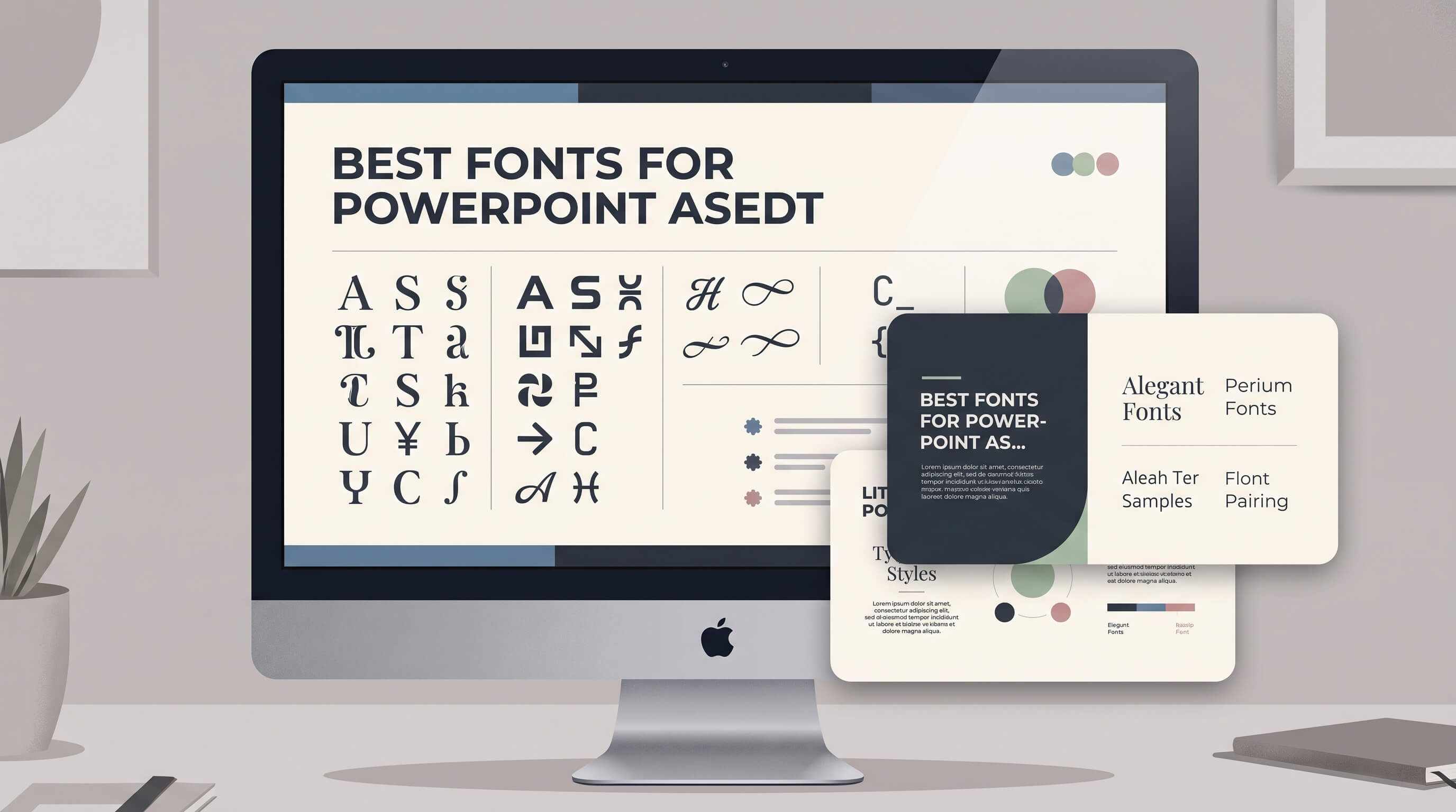
<p>Choosing the right font can make a significant difference in how your PowerPoint presentation looks and feels. The best fonts for PowerPoint are easy to read, visually consistent, and appropriate for the subject you're presenting.</p>
<p>Whether you're creating a business proposal, marketing report, educational presentation, or creative pitch deck, your font choices influence how audiences read and understand your slides. A font that looks attractive on your screen may become difficult to read when projected in a meeting room.</p>
<p>In this guide, we'll explore 15 presentation fonts, including popular Google Fonts, and explain how to choose the right typeface for different presentation styles.</p>
<h2>What Makes a Good Font for PowerPoint?</h2>
<p>A good presentation font should do more than look attractive. It should help your audience read information quickly without distracting them from your message.</p>
<p>Consider these four factors when choosing a font for your slides.</p>
<h3>1. Readability</h3>
<p>Readability is one of the most important factors when selecting presentation fonts. Your audience may view your slides from a distance, on a projector, or on a small laptop screen.</p>
<p>Fonts with clear letterforms, balanced spacing, and distinct characters are generally easier to read. Sans-serif fonts are particularly popular for presentations because of their clean and straightforward appearance.</p>
<h3>2. Consistency</h3>
<p>Using too many fonts can make a presentation look inconsistent. A practical approach is to use one font for headings and another for body text.</p>
<p>For example, you can combine a bold geometric font for headings with a neutral sans-serif font for paragraphs. Keep the combination consistent throughout your slides.</p>
<h3>3. Visual Hierarchy</h3>
<p>Different text elements should have different levels of visual importance. Headings, subtitles, body text, and captions should be easy to distinguish.</p>
<p>You can create visual hierarchy through font size, weight, and spacing instead of introducing multiple typefaces.</p>
<h3>4. Compatibility</h3>
<p>Font compatibility is especially important when sharing PowerPoint files with other people. A font installed on your computer may not be available on another device.</p>
<p>When using custom fonts, consider embedding them in your PowerPoint file if your version supports it. Alternatively, use fonts that are commonly available on your audience's devices or export your presentation as a PDF when appropriate.</p>
<h2>15 Best Fonts for PowerPoint Presentations</h2>
<p>Here are 15 fonts worth considering for different types of presentations. Many are available through Google Fonts, making them accessible for both personal and professional projects.</p>
<h3>1. Arial</h3>
<p><strong>Best for:</strong> Business presentations, reports, and corporate slides</p>
<p>Arial is a familiar sans-serif font that works well in a wide range of presentation styles. Its straightforward letterforms make it suitable for paragraphs, labels, and headings.</p>
<p>Because Arial is widely available on computers, it is also a practical choice when sharing editable PowerPoint files with colleagues or clients.</p>
<h3>2. Aptos</h3>
<p><strong>Best for:</strong> Modern business presentations and corporate reports</p>
<p>Aptos is Microsoft's modern default Office typeface. It has a contemporary appearance and is designed to work across different types of documents and presentations.</p>
<p>Its clean letterforms make it a useful option for presentations that contain a combination of headings, paragraphs, tables, and charts.</p>
<h3>3. Montserrat</h3>
<p><strong>Best for:</strong> Business pitches, marketing presentations, and title slides</p>
<p>Montserrat is a geometric sans-serif font inspired by urban typography. Its bold appearance makes it particularly suitable for large headings and presentation titles.</p>
<p>Although Montserrat works well for headlines, its heavier weights can feel dense in long paragraphs. Pair it with a more neutral font, such as Open Sans, for body text.</p>
<p>Google Fonts: <a href="https://fonts.google.com/specimen/Montserrat" target="_blank" rel="noopener noreferrer">Montserrat</a></p>
<h3>4. Open Sans</h3>
<p><strong>Best for:</strong> Business reports, educational slides, and content-heavy presentations</p>
<p>Open Sans is a humanist sans-serif font designed for legibility across different screen sizes. Its balanced proportions make it suitable for paragraphs, bullet points, and explanatory text.</p>
<p>It is a versatile option when your presentation contains a substantial amount of information and needs a clean, professional appearance.</p>
<p>Google Fonts: <a href="https://fonts.google.com/specimen/Open+Sans" target="_blank" rel="noopener noreferrer">Open Sans</a></p>
<h3>5. Roboto</h3>
<p><strong>Best for:</strong> Technology presentations, product demos, and business reports</p>
<p>Roboto combines geometric shapes with open curves, giving it a modern yet familiar appearance. It is designed to remain readable across different screen sizes.</p>
<p>Its range of weights makes it easy to create a consistent typographic hierarchy, from large headings to small annotations.</p>
<p>Google Fonts: <a href="https://fonts.google.com/specimen/Roboto" target="_blank" rel="noopener noreferrer">Roboto</a></p>
<h3>6. Lato</h3>
<p><strong>Best for:</strong> Corporate presentations, marketing decks, and professional proposals</p>
<p>Lato has a warm and approachable appearance without sacrificing its professional character. Its subtle details help it feel more human than some geometric sans-serif fonts.</p>
<p>It works well for both headings and body text, making it a practical choice if you prefer to use a single font throughout your presentation.</p>
<p>Google Fonts: <a href="https://fonts.google.com/specimen/Lato" target="_blank" rel="noopener noreferrer">Lato</a></p>
<h3>7. Poppins</h3>
<p><strong>Best for:</strong> Creative presentations, startup pitches, and marketing slides</p>
<p>Poppins is a geometric sans-serif font with distinctive circular shapes. Its modern style makes it popular for branding, presentation titles, and visual storytelling.</p>
<p>Use its heavier weights for headlines and lighter weights for supporting text. For dense slides, consider pairing it with a more neutral font.</p>
<p>Google Fonts: <a href="https://fonts.google.com/specimen/Poppins" target="_blank" rel="noopener noreferrer">Poppins</a></p>
<h3>8. Inter</h3>
<p><strong>Best for:</strong> Technology presentations, SaaS pitches, and data-driven reports</p>
<p>Inter was designed primarily for computer screens. Its carefully designed letterforms make it particularly useful for interfaces, dashboards, and presentations that contain numbers or detailed information.</p>
<p>Its clean appearance and extensive range of weights make it a flexible choice for modern business presentations.</p>
<p>Google Fonts: <a href="https://fonts.google.com/specimen/Inter" target="_blank" rel="noopener noreferrer">Inter</a></p>
<h3>9. Raleway</h3>
<p><strong>Best for:</strong> Creative pitches, portfolio presentations, and editorial slides</p>
<p>Raleway is an elegant sans-serif font with a distinctive, refined appearance. It works especially well for large headings and presentation covers.</p>
<p>Its lighter weights can look elegant, but they may be difficult to read when projected. Choose heavier weights for important text and use sufficient contrast.</p>
<p>Google Fonts: <a href="https://fonts.google.com/specimen/Raleway" target="_blank" rel="noopener noreferrer">Raleway</a></p>
<h3>10. Source Sans 3</h3>
<p><strong>Best for:</strong> Corporate reports, technical presentations, and educational content</p>
<p>Source Sans 3 is a clean sans-serif typeface designed for user interfaces and readable text. Its understated style makes it suitable for presentations where the content should take priority.</p>
<p>It is a useful option for long paragraphs, data explanations, and slides with multiple text elements.</p>
<p>Google Fonts: <a href="https://fonts.google.com/specimen/Source+Sans+3" target="_blank" rel="noopener noreferrer">Source Sans 3</a></p>
<h3>11. Nunito Sans</h3>
<p><strong>Best for:</strong> Educational presentations, startup pitches, and friendly business decks</p>
<p>Nunito Sans has rounded terminals and a friendly visual character. It offers a softer alternative to more formal corporate fonts while remaining suitable for professional slides.</p>
<p>Its balanced design makes it useful for headings and body text, particularly in presentations aimed at a broad audience.</p>
<p>Google Fonts: <a href="https://fonts.google.com/specimen/Nunito+Sans" target="_blank" rel="noopener noreferrer">Nunito Sans</a></p>
<h3>12. Manrope</h3>
<p><strong>Best for:</strong> Modern business presentations, technology pitches, and product showcases</p>
<p>Manrope is a modern sans-serif font with a clean geometric style. It has a contemporary appearance that works well for digital products, startup presentations, and business proposals.</p>
<p>Its distinctive headings can help establish a strong visual identity without requiring decorative typography.</p>
<p>Google Fonts: <a href="https://fonts.google.com/specimen/Manrope" target="_blank" rel="noopener noreferrer">Manrope</a></p>
<h3>13. Playfair Display</h3>
<p><strong>Best for:</strong> Editorial presentations, luxury brands, and creative storytelling</p>
<p>Playfair Display is a serif font with high contrast between thick and thin strokes. Its elegant appearance makes it suitable for presentation titles and short statements.</p>
<p>It is less suitable for small text or dense business reports. Pair it with a simple sans-serif font, such as Open Sans or Lato, to balance its decorative character.</p>
<p>Google Fonts: <a href="https://fonts.google.com/specimen/Playfair+Display" target="_blank" rel="noopener noreferrer">Playfair Display</a></p>
<h3>14. DM Sans</h3>
<p><strong>Best for:</strong> Marketing presentations, business proposals, and modern brand decks</p>
<p>DM Sans is a low-contrast geometric sans-serif font designed for readability at smaller sizes. Its simple, contemporary appearance works well in both formal and creative presentations.</p>
<p>It is especially useful when you want a modern visual style without making the typography too prominent.</p>
<p>Google Fonts: <a href="https://fonts.google.com/specimen/DM+Sans" target="_blank" rel="noopener noreferrer">DM Sans</a></p>
<h3>15. Merriweather</h3>
<p><strong>Best for:</strong> Educational presentations, editorial slides, and long-form content</p>
<p>Merriweather is a serif typeface designed for comfortable reading on screens. Its traditional appearance can add a more editorial feel to presentations.</p>
<p>It works well for short passages and quotations, especially when paired with a clean sans-serif font for headings or supporting information.</p>
<p>Google Fonts: <a href="https://fonts.google.com/specimen/Merriweather" target="_blank" rel="noopener noreferrer">Merriweather</a></p>
<h2>Best Font Combinations for PowerPoint</h2>
<p>Combining two complementary fonts can help create a clear visual hierarchy. The key is to choose fonts that serve different purposes without competing for attention.</p>
<table>
<thead>
<tr>
<th>Font Combination</th>
<th>Best For</th>
<th>Visual Style</th>
</tr>
</thead>
<tbody>
<tr>
<td>Montserrat + Open Sans</td>
<td>Business pitches</td>
<td>Bold and professional</td>
</tr>
<tr>
<td>Poppins + Lato</td>
<td>Marketing presentations</td>
<td>Modern and approachable</td>
</tr>
<tr>
<td>Playfair Display + Inter</td>
<td>Editorial and creative decks</td>
<td>Elegant and contemporary</td>
</tr>
<tr>
<td>Roboto + Roboto</td>
<td>Technology presentations</td>
<td>Consistent and minimal</td>
</tr>
<tr>
<td>Manrope + Source Sans 3</td>
<td>Startup and product pitches</td>
<td>Clean and modern</td>
</tr>
<tr>
<td>Raleway + Open Sans</td>
<td>Portfolio presentations</td>
<td>Refined and readable</td>
</tr>
</tbody>
</table>
<p>These combinations are starting points rather than strict rules. You can also use a single font family with different weights to create a consistent presentation style.</p>
<h2>Recommended Font Sizes for PowerPoint</h2>
<p>Font size affects how easily your audience can read your slides. The appropriate size depends on the presentation format, viewing distance, and amount of content.</p>
<table>
<thead>
<tr>
<th>Text Element</th>
<th>Suggested Font Size</th>
</tr>
</thead>
<tbody>
<tr>
<td>Presentation title</td>
<td>32–44 pt</td>
</tr>
<tr>
<td>Slide heading</td>
<td>28–36 pt</td>
</tr>
<tr>
<td>Subheading</td>
<td>22–28 pt</td>
</tr>
<tr>
<td>Body text</td>
<td>18–24 pt</td>
</tr>
<tr>
<td>Captions and footnotes</td>
<td>12–16 pt</td>
</tr>
</tbody>
</table>
<p>These are general guidelines, not fixed requirements. For presentations shown on large screens, you may need larger text, particularly for audiences seated far from the display.</p>
<p>Whenever possible, test your slides in presentation mode before delivering them. Check whether the text remains readable from the back of the room.</p>
<h2>How to Choose the Right Font for Your Presentation</h2>
<p>The best font depends on your audience, subject, and presentation format. Use the following considerations to narrow down your choices.</p>
<h3>For Business Presentations</h3>
<p>Choose clean, professional fonts such as Aptos, Arial, Inter, or Open Sans. These fonts work well for financial reports, corporate updates, and business proposals because they prioritize clarity.</p>
<h3>For Marketing Presentations</h3>
<p>Fonts such as Montserrat, Poppins, and DM Sans can give marketing slides a contemporary appearance. Use bold headings to emphasize key messages while keeping supporting text easy to read.</p>
<h3>For Startup Pitch Decks</h3>
<p>Consider fonts such as Manrope, Inter, or Montserrat. Their modern appearance can complement product screenshots, charts, and concise business statements.</p>
<h3>For Educational Presentations</h3>
<p>Open Sans, Lato, and Source Sans 3 are useful options for educational slides. Their readable letterforms can help audiences focus on the information rather than the typography.</p>
<h3>For Creative Presentations</h3>
<p>Creative presentations offer more flexibility. You can use fonts such as Playfair Display or Raleway to establish a distinctive visual identity. However, maintain readable body text and avoid excessive decorative styles.</p>
<h2>How to Install Google Fonts in PowerPoint</h2>
<p>Google Fonts provides a wide range of typefaces that you can use in your presentations. To use a Google Font in PowerPoint, follow these steps:</p>
<ol>
<li>Visit <a href="https://fonts.google.com/" target="_blank" rel="noopener noreferrer">Google Fonts</a> and search for the font you want to use.</li>
<li>Open the font family page and download the font files.</li>
<li>Extract the downloaded ZIP file if necessary.</li>
<li>Install the font on your computer. On Windows, right-click the font file and select <strong>Install</strong> or <strong>Install for all users</strong>.</li>
<li>Restart PowerPoint if it was already open.</li>
<li>Select the newly installed font from the font menu and apply it to your slides.</li>
</ol>
<p>Before sharing your presentation, check whether the recipient has the same font installed. You can also embed fonts in supported PowerPoint versions through the Save options, subject to the font's embedding permissions.</p>
<h2>Common Font Mistakes to Avoid</h2>
<p>Even a well-designed presentation can become difficult to follow if the typography is poorly managed. Avoid these common mistakes:</p>
<ul>
<li><strong>Using too many fonts:</strong> Limit your presentation to one or two font families unless you have a specific design reason to use more.</li>
<li><strong>Using fonts that are too small:</strong> Avoid shrinking body text simply to fit more information onto a slide. Simplify the content instead.</li>
<li><strong>Using low-contrast text:</strong> Make sure your text stands out clearly from the background.</li>
<li><strong>Using decorative fonts for paragraphs:</strong> Reserve expressive typefaces for titles or short statements.</li>
<li><strong>Ignoring font compatibility:</strong> Check how your presentation looks on the device or software you will use during the presentation.</li>
<li><strong>Using inconsistent font weights:</strong> Establish a consistent style for headings, body text, and supporting information.</li>
</ul>
<h2>Where to Find Fonts and PowerPoint Templates</h2>
<p>Google Fonts is a useful resource for finding free fonts for presentations. It allows you to explore different typefaces, preview text, and download font files for your projects.</p>
<p>If you need more than a font, a professionally designed PowerPoint template can also help you create a consistent visual identity. Templates provide predefined layouts, typography, color palettes, and graphic elements that you can customize for your presentation.</p>
<p>Explore the <a href="https://www.appiqa.com/product/font">Appiqa font collection</a> to discover fonts for your next creative project. You can also browse the <a href="https://www.appiqa.com/product/">Appiqa product collection</a> for presentation resources and design templates.</p>
<h2>Final Thoughts</h2>
<p>The best fonts for PowerPoint presentations are the ones that support your message and make your slides easy to understand. Fonts such as Arial, Aptos, Open Sans, Roboto, and Inter are practical choices for professional presentations, while Montserrat, Poppins, and Playfair Display offer more distinctive visual styles.</p>
<p>Start with readability, choose a font combination that matches your presentation's purpose, and maintain consistency across your slides. With the right typography, you can create presentations that look polished while keeping your audience focused on the information that matters.</p>
Recommended Architecture
Explore all